8 Packaging Trends Redefining The Wellness Industry, According To Designer Katja Vogt
As she conveys health and wellness brand’s stories through packaging, she’s noticed eco-conscious containers have dropped their rustic feel in favor of refinement and significance. “It’s no longer just about a beautiful look, it’s about creating something meaningful that respects the planet,” says Vogt, adding, “Minimal, calming aesthetics with uncluttered layouts and subtle finishes are on the rise because they signal purity and authenticity. Many labels and boxes now feature uncoated or recycled paper, and they emphasize natural textures to reinforce the notion of ‘less is more.'”
Vogt, who’s worked on the packaging of brands such as Fem Blends and InnoNature, expounded on her thoughts about packaging design trends in a recent LinkedIn post pinpointing eight she believes are redefining wellness. We’ve reprinted the post below with additional commentary.
“I’ve seen firsthand how color psychology impacts consumer perception. This isn’t just about using bright colors—it’s about creating an emotional journey that begins the moment someone sees your product. Conscious packaging can activate those feel-good neurotransmitters through intentional color combinations and patterns that reflect nature’s dopamine-boosting elements.
Key Benefits:
- Color differentiation based on product ingredients
- Helps products stand out in the competitive market
- Increases brand memorability through emotional connection”
Examples of color psychology-based packaging are Good Science’s color-blocked outer boxes, Wylde One’s vivid ombre boxes, Current State’s saturated bottles, and Bubble’s bright and glossy bottles.
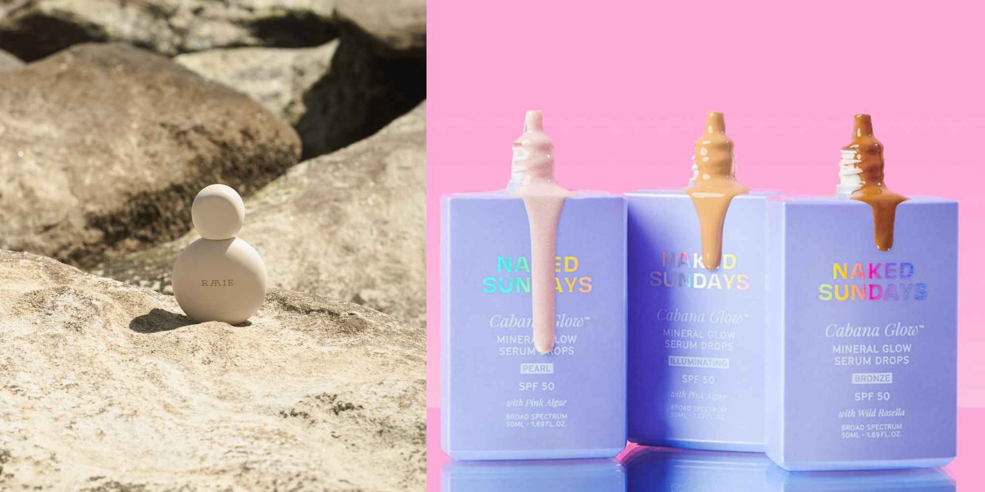
“Artisanal elements create an immediate association with authenticity, and especially for natural skincare lines, when they incorporate subtle ceramic-inspired textures, it can transform their market positioning from commercial to custom, leading to increased perceived value.
Artisanal packaging also aligns perfectly with natural and organic wellness products and gives the feeling of ‘personally crafted for you.’
Key Benefits:
- Enhances perceived value of natural products
- Differentiates from mass-produced alternatives
- Communicates premium quality and authenticity”
Examples of the artisanal aesthetics trend include Elume’s spherical stone-adorned jar tops in muted earth tones, Ositree’s shiny smooth rock-like bottle caps, Raie’s cream-colored bottles that evoke stones hand-picked on the beach and polished to perfection, and Cecred’s bottles that also resemble stones with a custom pebbled surface.
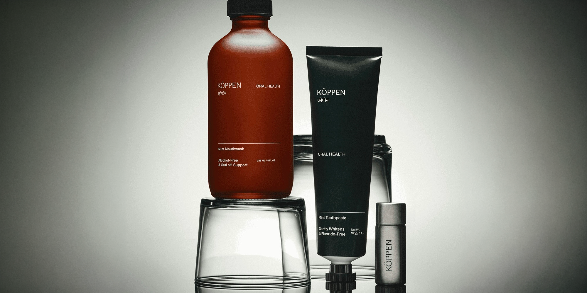
“In my experience designing for supplement brands, frosted glass creates an inherent premium positioning. It’s not just about the aesthetic—it’s about creating a multi-sensory experience that communicates purity and quality. Brands can also use varying levels of translucency to highlight product color and create sophisticated light interactions.
Key Benefits
- Creates premium positioning
- Provides protection from light degradation
- Caters to consumer demands for transparency”
The brands Monat, Eight Sleep, Habits and Kaleidoscope house supplements in elegant frosted glass bottles.
“Holographic touches create an almost crystal-like quality that resonates deeply with conscious consumers. The key is using this finish strategically. Think of delicate accents rather than an overwhelming presence. It’s about creating those magical moments of light interaction that change your product from functional to transformational.
Key Benefits
- Makes products stand out
- Creates memorable visual effects
- Communicates innovation and youthfulness”
Brands and products bringing the hologram foil to digital and physical shelves include mushroom coffee maker Everyday Dose, bath and shower line Bath Candy, sunscreen brand Naked Sundays and Love Is In The Air, a product made by designer and artist Zipeng Zhu for Pride Month.
“Premium cardboard or paper material can be strategically cut out to create special packaging that gives a premium look and feel. This can be used in smart and clever ways to cut the box and give visual hints about the product or reveal its key parts.
This also allows the product to become a part of the design story as there is minimal text, graphics, and clutter. Cutout packaging can enhance both form and function while creating interactive packaging elements.
Key Benefits
- Increases product visibility
- Creates engaging user experience
- Simple, clean designs that focus on essentials”
Lula, Havdypp and Rizos Studio are examples of brands employing cutouts in packaging to maximum effect.
“Incorporating these gentle color transitions on your packaging can create an immediate sense of calm or invigoration. These gradients mimic nature’s most peaceful moments—dawn and dusk. This warm and inviting look makes the products appear peaceful and hence it resonates a lot with wellness consumers.
Key Benefits
- Instantly catches the eye
- Creates a calm, approachable appearance
- Creates a strong visual without the need to add other elements”
Brands that have featured yellow and orange gradients include cannabis specialist Sula, fragrance brand Dedcool, supplements line Perla Helsa, wellness brand Wylde One and skincare maker Morning People. Pink and purple-focused gradients are wildly popular in beauty and wellness, too.
“In 2025, wellness brands will move from information-heavy packaging to a bold-minimal approach. The key is finding that sweet spot between clarity and sophistication while communicating complex benefits simply. This also enhances perceived value while building trust, especially with white space and clear typography hierarchies.
Key Benefits:
- Makes product benefits immediately clear
- Creates a professional, trustworthy appearance”
Personal care brand Good One, suncare range Le Rub, which also features animated gradients on its website, and baby food maker Yumi feature bold and unique logos that dominate their packaging while keeping other information to a minimum.
“This is my favorite because it directly enhances the product experience. It’s about creating portion-sized packaging for mindful consumption that guides users through their wellness journey, turning daily routines into meaningful rituals. This approach not only supports product efficacy but creates deeper brand loyalty through repeated usage and ritual building.
Key Benefits:
- Enhances product usage
- Creates habitual usage patterns
- Builds brand loyalty through ritual”
Wellness brands like Moon Juice, Recess, Wylde One, Element and Ned sell full-sized jars of powdered products, but consumers may leave their house only to realize they’ve skipped their supplements. By offering single-serve packets options, they can bring a perfectly-measured dose of their daily essentials with them wherever they go, helping the formation of a habit. It can also create nano out-of-home marketing moments when customers take their favorite ingestibles out of the cabinet and into the café.
The players
5 mentionedRitual

Momentous
AS Beauty
DedCool
Deeper